- Dagestani team of chefs wins culinary competition in Istanbul
- Dagestan introduces forest patrols and special fire-prevention regime
- Makhachkala to host festival of cross-national musical culture "Consonance of Victory"
- Dagestan to host international Forum on sustainable mountain area development with focus on tourism and economy
- Two large football complexes to be opened in Dagestan
- Advancement of Islamic finance discussed at St. Petersburg International Economic Forum 2025
- Makhachkala hosts first multi-brand exhibition of construction tools BISMAR EXPO 2025
- Dagestan and Omsk region sign multilateral cooperation agreement
- Dagestani Youth Affairs Ministry and Clover company agree to cooperate
- Dagestan becomes one of winners in "Native" All-Russian award
Derbent’s identity as part of new Daghestan brand
|
|
New, the whole Daghestan needs a fresh, recognizable visual style. We need a sunny, bright, and positive image to be seen everywhere helping improve its look to affects the conscious and the subconscious of local people and the guests.
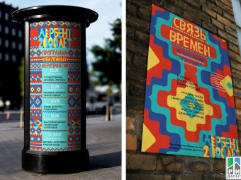
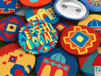
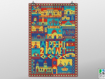
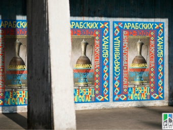
Designer Zaira Panayeva, a graduate of the British Higher School of Art and Design, wrote a thesis on "Identity of celebrating the 2,000th anniversary of Derbent city" which was rated "A" by leading Russian designers. This is a perfect example of how we can refresh our cities’ branding. Bold, but harmonious and respectful of the history. Carpet-like, traditional, yet brand-new and fashionable.
"The message of the work is that Derbent is an eternal city with an infinite history. I’ve woven an "endless carpet" into the never-ending story," Zaira says. "The carpet is the keynote stylistic element of the festive identity which can easily make a long line and fit in vertical decorations and billboards; and any carpet’s element can be used separately in advertising flyers, brochures, and so on." You take a closer look, and you want to go to Derbent! How do the artists do that, huh?


